
Flip
A Flip effect sees either:
- An entire image replaced with another, or
- Specific elements recoloured, replaced, or removed in the other image.
- Elements which flip should be of a similar size, shape and position in each image e.g. try to align eyes and facial features if flipping between faces.
- Text which flips should be the same style & size, and either be in the same position, or totally offset so as not to overlap at all. (Consign copious text & information to the backside of the print).
- Avoid using small and fine text, italics, Serif font styles, and diagonal lines. They’ll either disappear at certain angles or look staircased.
- Avoid flipping highly contrasting images, or flipping over a white or plain solid colour background so as to avoid ‘ghosting’ -where one image can be seen bleeding appreciably through another. Instead, use less contrasty images, textured or busy (highly detailed), bright, colourful images.
- Where possible, use the same background. The more that is the same in each frame, the more clearly the parts that change will stand out.
- Less is more! For small format prints 2 or 3 images are most effective. Keep in mind that the more frames that are used, the less movement is required to see each phase of the flip, and the ‘on’ time for each will be briefer.
- Flip effects can either be setup to “play” left-to-right or top-to-bottom. As a rule of thumb the latter generally works better. Unless you’re using your lenticular print as a display that people will be walking past, then a top-to-bottom flip effect is most often advised. This does not affect the artwork supplied.
- File type: PDF created in Illustrator. Set your document up with one page per flip image, and add an extra page if there’ll be a backside design.
- Colour mode: CMYK
- Colour profile: U.S. Web Coated (SWOP) v2
- File resolution: 300 ppi at full size
- Document bleed: the artwork must extend a minimum of 5 mm beyond the cut lines
- Image safe area: 3-5 mm inside the trim
- Any dielines, fold or perforation lines to be overlaid as a spot colour set to overprint. Download our template.
- Fonts: Outline in Illustrator
- Minimum font size for text which flips: 12 pt (75 LPI lens) or 10 pt (100 LPI lens) bold
- Minimum font size for text which remains static: e.g. 8 pt Myriad Pro bold (75 LPI lens)
- Rich black: C 50 M 25 Y 25 K 100
- Backside: high resolution PDF

Zoom
A Zoom effect sees either:
- An entire scene appear to approach or recede, like when zooming in or out a camera lens, or
- An object within the scene appear to enlarge or diminish in size.
The first and last frames in the sequence look sharp with adequate dwell time, whilst the intermediate animation frames display a fast motion blur.
- Zoom lenticular animations can consist of type and/or graphics that change size.
- Zooms work better when the background is a cool darker color with the zooming element a lighter and warmer color than the background.
- Avoid zooming over a white or plain solid colour background in order to reduce ghosting. Instead, use a patterned or busy (highly detailed) background.
- A zooming object should move directly forward or at a slight angle.
- Zoom effects can either be setup to “play” left-to-right or top-to-bottom. As a rule of thumb the latter generally works better. This does not affect the artwork supplied.
It is not necessary to supply the “in-between” images of a zoom. The beginning and end phases will be sufficient.
- File type: Illustrator. The start phase on page 1, and the end phase on page 2. If there’ll be a backside print, add an extra page as the last page in your document.
- Colour mode: CMYK
- Colour profile: U.S. Web Coated (SWOP) v2
- File resolution: 300 ppi at full size
- Document bleed: the artwork must extend a minimum of 5 mm beyond the cut lines
- Image safe area: 3 mm inside the trim
- Any dielines, fold or perforation lines to be overlaid as a spot colour set to overprint. Download our template.
- Fonts: Outline in Illustrator
- Minimum font size for text which remains static: e.g. 8 pt Myriad Pro bold (75 LPI lens)
- Rich black: C 50 M 25 Y 25 K 100
- Backside: high resolution PDF
- Minimum font size for text which remains static: e.g. 8 pt Myriad Pro bold (75 LPI lens)
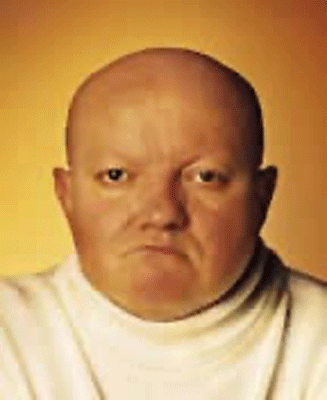
Morph
A Morph effect is the metamorphosis of one object into another.
The most effective morphs use objects with similar shapes or common landmarks (eyes, ears, nose, and mouth) which can be mapped from one image to the other.
The first and last frames in the sequence look sharp with adequate dwell time, whilst the intermediate animation frames display a fast motion blur.
- Elements which morph should be of a similar size, shape and position in each image e.g. try to align eyes and facial features if morphing between faces.
- Avoid morphing highly contrasting objects, or morphing over a white or plain solid colour background. Instead, use a patterned or busy (highly detailed), bright colourful background.
- Where possible, use the same background in both images. The more that is the same in each frame, the more clearly the parts that change will stand out.
- Avoid using small and fine text, italics, Serif font styles, and diagonal lines in your design. They’ll either disappear at certain angles or look staircased.
- Morph effects can either be setup to “play” left-to-right or top-to-bottom. As a rule of thumb the latter works better. This does not affect the artwork supplied.
It is not necessary to supply the “in-between” images of a morph. The beginning and end phases will be sufficient.
- File type: Photoshop file with clearly labelled layers. Both of the objects involved in the morph should be supplied on their own transparent layer. If either has been cut out from the background layer, then you must clone in the hole left behind.
- Colour mode: RGB. (Morphing software is made for the video industry). Colours will shift when converted to CMYK for printing.
- Colour profile: Adobe 1998
- File resolution: 300 ppi at full size
- Document bleed: the artwork must extend a minimum of 5 mm beyond the cut lines
- Image safe area: 3-5 mm inside the trim
- Any dielines, fold or perforation lines to be overlaid as a spot colour set to overprint. (Send as a separate vector PDF).
- Fonts: Rasterised
- Minimum font size for text which remains static: e.g. 8 pt Myriad Pro bold (75 LPI lens)
- Rich black: C 50 M 25 Y 25 K 100
- Backside: high resolution PDF
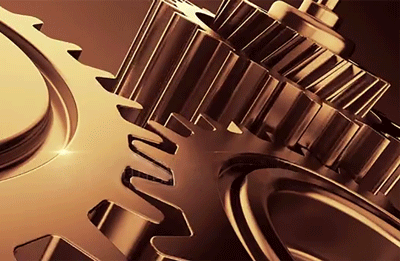
Animation
An Animation effect is comprised of 4 or 6 sequential images.
- ‘Cyclical Animation‘ has no definite start or end frame. e.g. turning cogs.
- ‘Terminal Animation‘ has a clearly defined start and end frame. e.g. filling a glass…empty and full.
- The depicted motion must have a simple linear or circular path in a single direction.
- The animating object/s should not track horizontally across the print, but ideally be constrained to roughly the same position.
- Avoid animating over a white or plain solid colour background. Instead, use a patterned or busy (highly detailed), bright colourful background.
- Ideally, the background should remain fixed so that only the key object/s move. The more that is the same in each frame, the more clearly the parts that change will stand out.
- Avoid using small and fine text, italics, Serif font styles, and diagonal lines in your design. They’ll either disappear at certain angles or look staircased.
- Animation effects comprising of 4 frames may still work in a left-to-right direction -depending on the artwork, but top-to-bottom will work better for 4 or more frames. This does not affect the artwork supplied.
- File type: Illustrator (one page per animation frame), or a Photoshop file with clearly labelled layers for each frame. Don’t flatten the animating object with the background. Any superimposed text or logos should not be flattened either.
- Colour mode: CMYK
- Colour profile: U.S. Web Coated (SWOP) v2
- File resolution: 300 ppi at full size
- Document bleed: the artwork must extend a minimum of 5 mm beyond the cut lines
- Image safe area: 3-5 mm inside the trim
- Any dielines, fold or perforation lines to be overlaid as a spot colour set to overprint. Download our template.
- Fonts: Outline in Illustrator and Indesign, and rasterise in Photoshop
- Minimum font size for text which remains static: e.g. 8 pt Myriad Pro bold (75 LPI lens)
- Rich black: C 50 M 25 Y 25 K 100
- Backside: high resolution PDF
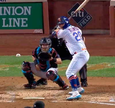
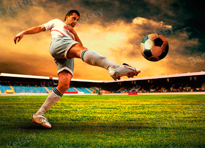
Video
A Video effect plays a short duration of actual video footage.
The first and last frames in the sequence look sharp with adequate dwell time, whilst the intermediate animation frames display a fast motion blur.
- Choose footage which has either been recorded with the camera on a tripod or stabilised in post production.
- If possible, the background should remain fixed so that only the key object plays out its action on the same spot. The more that is the same in each frame, the more clearly the parts that change will stand out.
- The key subject should remain centered throughout the series of frames. It’s generally okay if this means the background moves, provided it’s in the one direction at small increments from frame to frame.
- The depicted motion of the key subject must have a simple linear or circular path in a single direction.
- Avoid footage with the key subject over a white or plain solid colour background. Instead, use a patterned or busy (highly detailed), bright colourful background.
- Avoid using small and fine text, italics, Serif font styles, and diagonal lines in your design. They’ll either disappear at certain angles or look staircased.
- Video effects must play top-to-bottom.
Provide us with your video footage file. We will assess if it is suitable, and if so whether a shorter duration should be sampled to extract perhaps 12-18 frames. Keep in mind that if frames need to be repositioned to superimpose the main action, and then cropped to suit print dimensions, higher definition footage may be required to achieve 300 ppi for print quality.
- File type: Quicktime or MPEG
- Colour mode: RGB. (Video editing software works in RGB mode). Colours will shift when converted to CMYK for printing.
- Colour profile: Adobe 1998
- File resolution: Full HD (1080p), 2K, or 4K
- Document bleed: the artwork must extend a minimum of 5 mm beyond the cut lines
- Image safe area: 3-5 mm inside the trim
- Any dielines, fold or perforation lines to be overlaid as a spot colour set to overprint. Download our template.
- Fonts: Rasterised
- Minimum font size for text which remains static: e.g. 8 pt Myriad Pro bold (75 LPI lens)
- Rich black: C 50 M 25 Y 25 K 100
- Backside: high resolution PDF
3D
In the 3D effect, objects are distributed spatially at different depth planes.
Elements like text must be positioned at or near the lens plane so as to be rendered in focus. Elements become increasingly softer the more remote their location from the lens plane.
The same visual cues we use in everyday life to inform us of which object is closer or farther than another is just as pertinent for 3D lenticular design.
- Design with partial overlap of objects.
- Try to avoid using lots of solid colors and line art. 3D lenticular works best in busy images with lots of texture!
- The more layers of elements that appear in the design, the more “depth information” there will be for the viewer.
- Use perspective (convergence of parallel lines into the distance) to enhance the illusion of depth.
- Use a ‘busy’, detailed, colourful or patterned background.
- Avoid white or solid colour backgrounds as these will give rise to ghosting, and provide no depth cues whatsoever, killing the depth in your print.
- Avoid the use of horizontal lines as they too provide no depth cue.
- Avoid using small and fine text, italics, Serif font styles, and diagonal lines. They’ll either disappear at certain angles or look staircased.
- Keep in mind that a mediocre design will still look mediocre in 3D.
There is no maximum to the number of layers, but please ensure elements in the scene are properly separated.
Objects which overlap must be separated from each other on individual layers AND you must clone in the hole left behind on the layer from which you cut out the foreground element.
Viewers don’t tolerate unsharp text, logos, and eyes -these will need to be positioned by us at or near the print’s surface.
Do not position text over elements which need to project forward of the print surface.
- File type: Photoshop layered file at full size
- Colour mode: CMYK
- Colour profile: U.S. Web Coated (SWOP) v2
- File resolution: 300 ppi at full size
- Document bleed: the artwork must extend a minimum of 5 mm top and bottom beyond the cut lines. On the left and right sides it must extend at least 1.12 x beyond the cut lines e.g. for a print 100 mm wide, add 12 mm to the left and right sides. Canvas width = 124 mm
- Image safe area: 3-5 mm inside the trim
- Any dielines, fold or perforation lines to be overlaid as a spot colour set to overprint. Download our template.
- Fonts: Rasterise all text layers
- Minimum font size for text which remains static: e.g. 8 pt Myriad Pro bold (75 LPI lens)
- Rich black: C 50 M 25 Y 25 K 100
- Remove all layer Groups
- Do NOT flatten layers; text, logos and 3D objects must be accessible
- Layers should be ordered in sequence and appropriately labelled
- Layer Blending mode must be set to Normal
- Layer Opacity is supported (0% – 100% slider)
- Flatten all layer effects (File->Scripts-> Flatten All Layer Effects)
- Flatten all Masks (File->Scripts-> Flatten All Masks)
- Merge all Adjustment layers
- Rasterize all Smart layers
- Remove Alpha Channels
- Backside: a high resolution PDF